Asterisks for Rates

Are you an internet professional on the verge of leaping into independent self-employment as a web designer and developer? Are you wondering how much you should charge clients for your services? Do you want to know how to find out other developers’ rates without going through the awkward or risky routes of meatspace networking, direct questioning, or smalltime corporate espionage?

Google Search wildcards to the rescue! By just plugging an asterisk into where the value would be, you can get a quick overview of the gamut of web pro hourly rates worldwide, thanks to forum posts from random designers and developers out there with nothing to hide! (The trick also seems to work for a variety of other professions and currencies.)

So, how much will you charge?

Assorted Weekend Snaps

Just clearing out a backlog of photos from the last three weekends. Here’s a sampling for you. (Click on the thumbs to get the larger photo on Flickr.)

IMG_3864 IMG_3842 IMG_3876 IMG_3877 IMG_3888 IMG_3879 IMG_3883 mall-sunset Stand Far From Disembodied Head Wearing Cap IMG_3929 IMG_3935 IMG_3939 IMG_3936

Fall is definitely upon us.

The Coin Set

Hey, print and web designers, you know how once in a while you need to do a layout for an article on money or economics or investments or something, and you need a quick thematic header graphic, like, a photo of coins or something, and even though you come across photos of coins all the time, suddenly you can’t find any good public domain, royalty-free photos anywhere to use for your design? I’m solving that problem right now. Meet The Coin Set.

I was about to cash a year of accumulated pocket change in the Coinstar machine last week, and I figured I’d take some photos of the coins first, just in case I ever need photos of coins. I’m releasing all the coin photos into the public domain for anyone else who needs closeup photos of piles of American coins. Get them here.

I’ll add to that set as I get more photos: always in the public domain, which means no more flipping through Clipart.com or Image Bank while reading the fine print on each photo, and you don’t need my permission to use, reuse, edit, or redistribute them. Some of the photos are kind of dark (no flash), but nothing a quick Levels job in Photoshop can’t fix. (This is probably a trivial drop in an ocean of public domain photos out there, but oceans need drops too, and these are my drops.)

Cheap and Tiny and Popular

Just a link from Matt, and suddenly Cheap And Tiny is rubbing shoulders with the big guys on del.icio.us/popular. Traffic jumped from 600 hits a day (117 unique visits) to 15,021 hits (1,754 unique visits), and income from ad clicks went from “near nil” to “modestly pleasant.” I’m still tweaking the Google Adsense and Chitika ad positions to see what improves performance, and I’m open to recommendations for search terms to plug into the Chitika code to match the weblog audience’s expectations.

An anonymous commenter on 248am.com doesn’t like the design of Cheap And Tiny. I’ve tried to keep it light and clean, while smoothly integrating advertising elements into the layout — but without resorting to deceptive styling to make it look like the ads are part of the content. Does anyone else think the site is confusing? That WordPress theme (I call it “Yurt,” for no particular reason) will be the basis for other upcoming projects, so feedback on that will help improve future weblogs on the same network.

Droids and Brothers

From a conversation with Amy last night:

Amy: Bob got his DVD of Episode III last night.

Me: Personally, I’m a lot more comfortable pretending that the whole prequel never happened. In Episode 4, Obi-Wan says “Luke, here’s your Dad’s lightsaber. He wanted you to have it,” and I’m yelling, “No he didn’t.” And Anakin making C3-P0? So that means C3-P0 is kind of like Luke’s brother?

Amy: Only in the way that Henry Ford’s Model T was his son’s brother.

Blood Spatter

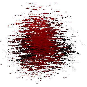
Happy Halloween or Reformation Day! The blood spatter on my site can speak to you of zombies and vampires out for brains or blood respectively, or of the spilled blood of the martyrs for the faith. Read some of Holy Office’s history on the mixed, mostly non-pagan origins of Halloween, and then check out The Dane’s uber-awesome pumpkin carving skillz. And Brandon and Wendy’s too.

Now, here’s how to do a quick and dirty blood spatter effect in Photoshop:

  1. Draw shape on white background. (Straight onto background layer, not a new layer.) Any shape you like.
  2. Foreground color #FF0000, background color #660000. Render / Clouds filter.
  3. Brush Strokes / Sprayed Strokes filter, tweak settings till the shape looks reasonably ragged. Repeat for effect if desired. (You thought I was going to use the Spatter filter? You can, if you like, in the next step, but I don’t like the effect as much.)
  4. Optional: Tweak Levels to add gritty darks, and use the Spatter filter and more Sprayed Strokes to make a bigger mess.

It’s really amateur-looking, certainly nothing approaching the quality of Stan’s blood stains, but hey, it takes two minutes to do — maybe one if you’re quick with Photoshop keyboard shortcuts.

Stop Hiding Login!

Update: I <3 SideJobTrack. That’s all.


To my dearest SideJobTrack, Livejournal, Ning, Commission Junction, and a few other websites out there:

You are valuable services, and I love you all from the bottom of my heart, but I have an urgent request: please stop hiding your login forms behind javascript show/hide links! I’m very keyboard-oriented, so my first reflex when signing in to a service is to TAB to the login fields, type my username and password, and press Enter. When you require a click on a “Sign in” link to pop up the login form element, you force me to move my hand to the mouse, thus wasting precious seconds I could be spending typing in my info. It all adds up. So please, show your login forms in plain sight.

(And please don’t tell me to set my TAB to go through links as well as form elements. That’s unacceptable; this isn’t Internet Explorer.)

The same goes for you too, Flickr, making me click through no less than two screens (1,2) to get in. I suggest a simple form on your front page with a username and password field, and two radio buttons: one for classic Flickr users and the other for merged Yahoo accounts. Should be pretty easy for that to forward to a script which determines what goes to which login server.

Come on, there’s nothing wrong with showing a few text fields and a submit button on your front page. It’s not a blight on your design, and it makes things easier for your users.

eBay “Notification Preferences”

eBay Notification PreferencesHas anyone else noticed a lot more incoming spam “marketing” email from eBay which turns out to be authentic and not just more phishing attempts? Yeah, me too. Here’s how to kill the spam:

  1. Go to your My eBay page and click on “Preferences” under “My Account.”
  2. Click on “Notification Preferences,” which should take you to a login screen. (So they make you log in again just to change subscription preferences: added layer of security or punishment by annoyance for opting out?)
  3. In the Preferences page — with an ominous “OptinLoginShow” in its URL — scroll down to “Newsletters, Promotions, and Event Notifications,” conveniently tucked away near the bottom of the page.
  4. Uncheckizzle that shizzle and submizzle. Note, it says at the bottom, It may take up to 10 days to process changes to these preferences. 10 more days of possible spam, telemarketing, and junk mail. eBay loves you just that much!

Nothing new. Just like Yahoo “marketing” preferences of yore, eBay has decided to go with the not-wholly unexpected business strategy of using unsolicited direct advertising to antagonize customers, and hiding away the option of turning the junk off. Way to go, BigCo.