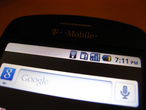
First off, I refuse to call it the “MyTouch.” Starting a proper noun with such a strong possessive pronoun just confuses the use of any article — or any other possessive pronouns — preceding the name. “A MyTouch.” “The MyTouch.” “My MyTouch.” “Your MyTouch.” Plus, it sounds like the setup for a bad “your mom” joke. No, I will refer to it at all times by its actual model name, the HTC Magic. I bought mine at a Costco cellphone stand for about $200 and a 2 year contract extension on my T-Mobile account. (This turned out to be a mistake, as the contract price dropped to $99 not long after.)
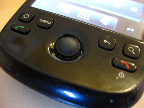
The first thing you notice about the HTC Magic is its “chin.” It’s an interesting design flourish and not at all obtrusive, causing no bump in the phone’s pocket profile and subtly improving the angle at which the user holds the screen while manipulating the scroll wheel and buttons. At the bottom of the chin is a mini-USB port which allows data sync and charging.
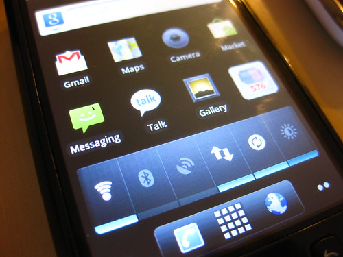
After my experience with s60v5 on the Nokia 5800, Android came as a breath of fresh air. I greatly appreciated icon-and-widget customizable multi-page home screens and the pull-down notification bar with at-a-glance email, call, and message info — features I found lacking on the 2nd generation iPod Touch I used alongside the Phone. (More on iOS in an upcoming entry.) Best of all was the tight Google account integration, with native GMail and GTalk apps and a very useful Calendar widget which stayed on my home screen main page. Maps, Navigation, and built-in Latitude were also much more powerful than their iOS Google app counterparts.
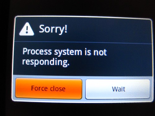
The versatility of this feature set, however, was sadly dampened by Android’s heavy resource usage, made worse by the fact that the specific variety of HTC Magic used by T-Mobile, the 32B, has 192MB RAM (compared to 288MB on the 32A), and came with CPU speed throttled down to save on battery life. Apparently this throttling ended with the Froyo 2.2 upgrade, but performance still suffered. Frame rate on various UI animations was noticeably choppy, app startup and camera app shutter response were painfully slow, and keyboard tap response sometimes stretched into the order of seconds. I had thought these problems would end with the Froyo 2.2 upgrade but the phone just slowed further. I would later root the phone to replace the T-Mobile Android ROM with CyanogenMod 6, but every subsequent upgrade only worsened performance, even with an overclocking widget installed as a last resort.
The native photo gallery app in Android 2.2 was an especially egregious offender, with its unnecessarily swooshy 3D animations, blurred backgrounds, and constant crashing. Everything about the app seemed calculated to max out phone cycles to the point of unusable slowness and instability. This was a major factor in my decision to dump Android: the native gallery app was an unapologetic resource hog without a “simple mode,” thus necessitating the purchase of a higher-powered phone. (Although some Nexus One users told me they had similar problems with slow tap response and choppy framerate.) It seemed like certain aspects of the Android OS had been designed for gratuitous “wow” effects without consideration for universal cross-device performance, which soured me on the experience despite the joys of Google integration.
Going back to the phone’s “chin,” take a look at the button bars of the three phones I’ve had in the last two years. The HTC Magic is in the middle. Notice anything?
That’s a lot of buttons. Those four hardware buttons — home, back, search, menu — are integral to the Android user interface. Home brings you to the home screen, Search generally toggles a search field, Menu should ideally show additional contextual menu options, and Back variably means reverse through screen history or return to app main screen or cancel/undo the last action or sometimes nothing at all, on an app-to-app basis.
While input-centric behavioral inconsistencies are common to app development on any platform, it’s especially jarring on Android, where seamless flow is disrupted by a touchscreen interface relying on offscreen hardware buttons for essential functions. Many other quirky details like this cumulatively soured me on the Android experience, at least as presented to me on this phone.
For a while I just used the HTC Magic as a simple phone for calls and SMS, and ran a wifi hotspot app so I could tether my iPod Touch to 3G for more dynamic internet use on a less annoying device, but this caused the phone to heat up alarmingly fast, while taking a huge bite out of battery life (as in, 1% battery per minute).
All in all, I really did like Android and was willing to put up with its GUI quirks, but not the slowness. It just needs a much better processor — or even a mobile GPU — to work usably. Eventually I gave up and bought a secondhand iPhone, jailbroken and unlocked. But that’s another story.
Postscript: I also tried to “dogfood” this entry and write it out on the HTC Magic with a Simplenote app. That went a lot better than on the Nokia 5800, though already-laggy tap response did get increasingly troublesome when the entry reached about 2/3 of its current size, but it was fully able to copy/paste the entry and get off the phone.
Postscript 2: It’s worth noting that T-Mobile is still updating the MyTouch line of phones with newer models. (But sadly keeping the “MyTouch” brand.)


