(I wrote this review years ago but forgot to finish it. Though hardly relevant these days, I am posting it backdated now just as a reminder of the earlier days of Nokia’s decline.)
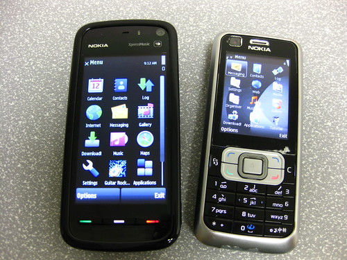
By mid-2009, my old Nokia 6120c had descended into unusability with random shutdowns and blank-screen wakeups, so I decided it was time for a new phone. Out of continued brand loyalty I decided to try the Nokia 5800, purchased unlocked from Amazon for $339. (Update: down to $279 as of 2011.)
The 5800 ended this aforementioned brand loyalty; Nokia’s first “multimedia” touchscreen mobile phone was the last Nokia phone I would ever own.
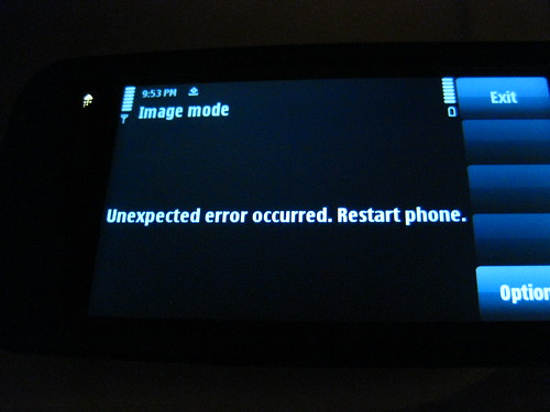
My troubles began when the 5800 arrived with a dealbreaking bug: the camera and image gallery apps consistently caused the phone to freeze and crash, even after a firmware upgrade. I returned it and got a quick replacement through Amazon RMA, but my troubles had still just only begun. The phone became intolerable within three months.
But I’ll try and be positive by starting with the good stuff.
Hardware
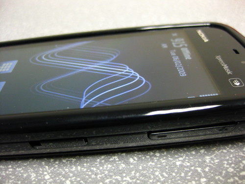
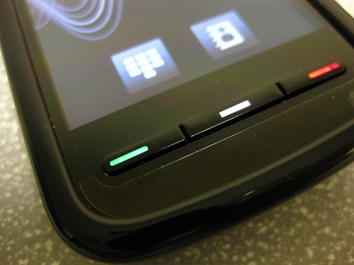
The Nokia 5800 was of excellent build quality, with a firm, solid, countoured body — no loose or jiggly or ill-fitting parts or panels or covers or buttons. The resistive screen responded nicely to fingernail, stylus, or a firm thumb-press, and was bright and clear enough to be usable in bright sunlight — although the dark default OS theme hindered that a bit. The speakerphone was very loud, which was good.
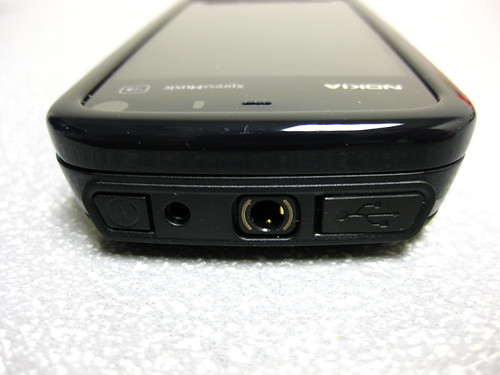
The 434 MHz ARM11 processor and 256MB RAM pushed the lower end of current (at the time) smartphone specs but were sufficient for Symbian’s needs. Wireless connectivity: WiFi, EDGE, and 3G (AWS 850/1900 MHz) — against my hopes, still incompatible with T-Mobile USA’s AWS 1700/2100 MHz 3G ban. The phone sported a micro-USB port for data sync, but not for charging, so I still needed an AC brick and electrical outlet; no charging through USB.
And now, the bad news.
Software
Symbian s60v5 is a usability disaster, a pile of hilariously unintuitive user interface mistakes and omissions whose cumulative effect on me was avoidance. Nokia can’t seem let go of its hardware keyboard-and-buttons roots, resulting in a touchscreen UI which is a giant step back, marred by obtrusive text entry, needlessly huge options buttons, tap-heavy nested menus, and inconsistent interaction conventions.
In Your Face. This obtrusiveness is a recurring theme through the UI. They say a good user interface stays out of the way so the user barely knows it’s there — but I definitely knew s60v5 was there, and not in a good way. The system is constantly in your face, requiring multiple taps through nested menus to get basic things done, popping up un-dismissable alert dialogs with uncomfortably long close delays, and generally reminding you that this interface was originally built for hardware keyboards and not touchscreens.
Interruptive Text Entry. Nothing feels quite so haphazardly slapped on to the s60v5 interface as text entry. There are multiple modes available: giant fullscreen QWERTY without T9, mini-QWERTY so tiny it needs the stylus, clunky handwriting with dubious character recognition, and a fullscreen standard numeric keypad with T9. In all cases, toggling text entry (usually by clicking on a text input field) pops up a text entry mode that obscures the task at hand and interrupts interface flow till you click a checkmark to indicate you are done entering text.
Tap. Double-tap. Swipe. Slide. Inconsistent UI conventions abound from screen to screen. Some menus need a single-tap to select an icon or list item; other menus require a double-tap. Scrolling down a page generally requires dragging a scroll bar on the right side of the screen, but other apps have incorporated dragging from anywhere on a page.
Disappearing Pencil. One of my favorite things about the old Symbian interface on the 6600 was the “pencil” button, which provided text selection, copy/paste, and multiple menu item select capability. That sadly disappeared from Symbian on the 6120c and 5800, replaced by an “Editing Options” submenu hidden behind a press of the star key — but that didn’t handle the loss of multiple-selection, which I wished for more than once for various file and media management tasks. Worse, the editing options in S60v5 were inconsistently implemented, and nonexistent in the web browser, even in text input fields, where I most needed them.
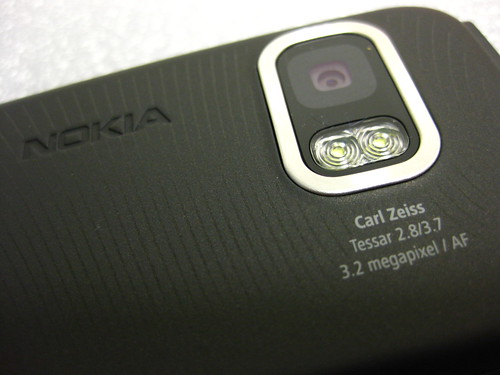
Photo Woe. The camera, with it’s Carl Zeiss lens and quick shutter hotkey access, is the one high point of the 5800 where picture quality is concerned — but one must wrest these lovely photos from the clutches of a user interface that concentrates the bullheadedness of S60v5 into a distillation of anti-user bugginess. The camera app repeatedly forgot my photo settings: most often resetting photo modes and turning on the flash where I didn’t want it, necessitating a slog through menus nested two taps deep for a function which rightly should have been accessible right from the preview screen. Not to mention that the camera app would still occasionally crash the phone — though less often than the first unit, at least.
I could go on. I tried to “dogfood” this review, writing most of this entry on the phone’s native notes app. S60v5 fought me every step of the way, first with obtuse text input, then tap-response slowdowns as the entry grew in size, then freezes and crashes when I tried to send the entry text to email or to the clipboard to liberate the text from the phone. *
I gave up. I wondered if I should hold out for the Nokia N97 instead, in hopes that some user interface lessons would have been learned, but as evidenced by this video from Engdaget, subsequent Symbian phones had the same problems:
Update: video gone but it showed a bad N97 touchscreen
Three months after purchasing the Nokia 5800 I bought an Android HTC Magic 32B. But that is another story. **
* Postscript 1: I now finish and backdate this entry two years later from an iPhone, of all things.
** Postscript 2: I passed on the 5800 to my wife with the promise that if it was as troublesome for her as it had been for me, we could purchase her something better. She’s been fine with it, not having my heavy data needs, and the phone has lasted her almost two and a half years, which is at least a testament to the build quality of the hardware.
Additional info: GSM Arena specs page for Nokia 5800, and Chris Ziegler’s Nokia 5800 review on Engadget.
