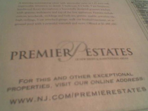
When designing logos, sometimes it’s nice to split evenly worded logo type in half with a light, stylized design element. The separation reinforces a sense of symmetry and, tastefully done, can subtly strengthen brand recognition.
On the other hand, sometimes a designer decides to use a typographic flourish as the separating element, which — not being light, large, or different enough to be perceived as being distinct from the main logo type itself — creates a new word altogether. In this case, PremierPestates.
